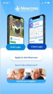
NEWCROSS HEALTHCARE x HFGO MOBILE APP
The HealthForceGo app simply and instantly matches the country’s nurses and carers to the people who need them most. Clients can find the best qualified and experienced healthcare workers to fit their needs, and nurses and carers can find new opportunities for work that fits around their lives.
The goal was to rethink and redesign the HFGo app to offer a world class user experience which will sit at the core of a local, national and global healthcare ecosystem.
WHERE WE STARTED
The redesign the HealthForceGo app was initiated in late 2021. We started auditing the HFGo app for both the staff and the client side.
Key findings
Dated look and feel not inline with the new brand look and feel.
Lacks brand personality and seems very functional.
Copy is often quite formal and ‘wordy’.
The app is very ‘blue’ and needs a secondary colour to help the user navigate.
Some of the app does not pass AA web accessibility standards.
User flows are often confusing and complex with many clicks for the user.
Key information is hidden in tool tips.
Information architecture is confusing and hidden.
OLD APP SCREENS
Customer journey mapping workshops
The product team conducted 4 workshops to map each touchpoint of the staff app. The goal of these workshops were to better understand the pain-points of the staff and to see the opportunities Newcross has to build a world-class user experience. We involved many people from across the business including from the Development team, Marketing team, Human Resources, Learning and Development team and the Operations team to help us with our insights.
Key findings
Staff are not tech savvy
Staff expect support
Time consuming user flows
Slow loading time
Education on features usage and benefits
Inconsistent interactions and functionality
Some features are not optimised
for mobileDated and text heavy
Need for personalisation
London and remote workshops
The product team spent 4 days understanding, brainstorming and sketching concepts to simplify the HealthForceGo staff app flows.
We looked at each part of the app and re-structured the Information Architecture together. We also conducted a ‘Crazy 8’s’ sketching session with the product team and a few people from the wider business.
“Crazy 8’s is a fast sketching exercise that challenges people to sketch eight distinct ideas in 14 minutes. The goal is to push beyond your first idea, frequently the least innovative, and to generate a wide variety of solutions to your challenge”
FLOWs REVIEW AND USER INTERVIEWS
We then reviewed each section from the user's perspective, identifying pain-points and areas where the app could be improved. We also interviewed our Mobile Apps Champions, Healthcare staff who give us a better insight into their use of the app.
Wires, prototyping and user testing
Building on the redefined UX flows in ideation sessions, the team produced a series of wireframes and low fidelity prototypes for user testing with staff in the branches.
Based on the insight generated by the multiple user testing sessions we then refined the flows before moving ahead to the next stage of UI concepting.
UI CONCEPTING
Having already started building a pattern library or UI design kit in Figma which is now part of the current Halo Design System, the process of UI concepting produced three distinct design design routes from which we had to decide on a direction to develop further.
1. The “trusted” route
Builds on the brand guidelines, uses the Newcross logo as a graphic device to mask video and photography.
The branding feels part of the Newcross digital family as it uses the photography, videos and visual language of the website. This reinforces brand loyalty and trust.
Design and functionality are simple and easy to use.
Parts of the layout or illustrations could animate to create a ‘moment of delight’ for the user.
2. The “challenger” route
Takes some of the main themes from the branding workshop: sense of community, innovation and industry leader, multicultural and diversity and challenging and driving change and works them into the branding and language. This route creates a sense of community and diversity by using shapes from different patterns around the world.
The branding is bold and exciting representing innovation and striving to be the healthcare industry leader.
3. The “minimalist” route
The minimalist route allows the content of HealthForceGo to be the focal point for the user. The branding is stripped back to photography, video, typography, shape colour and negative space.
The UI and functionality is simple and easy to use.
The soft triad gradients reflect healthcare and feeling of empathy creating a harmonious balance between friendly and professional branding.
The four lines of business colours are present in the gradients, creating the feeling of one brand.
REFINED UI - KEY SCREENS
A decision was made to further develop the UI direction by mixing the proposed routes 1 & 2.
HIGH FIDELITY UI Prototypes & User testing
Before development we tested the high fidelity UI prototypes with our healthcare staff and amended the designs according to the user's feedback.


